Heldere uitleg van de NOW: waarom visuele uitleg?
[English version below]
Onlangs was ik op zoek naar informatie over hoe de NOW 3 in elkaar zat. Ik kwam daarbij een ‘visual’ van de overheid tegen. Ten eerste verbaasde ik me erover dat de visual werkelijk geen enkele visual bevat. Het is enkel een PDF met kaders met tekst, die weliswaar is opgemaakt in de overheids-huisstijl, maar echt visueel vond ik ‘m niet. Ze hebben gekeken naar een layout om de tekst te herstructureren, wat op zichzelf wel helder opgemaakt is, maar er zit geen duidelijke volgorde/hierarchie in die de informatie verduidelijkt. Dat is wat we met visualisatie juist kunnen benadrukken/verbeteren. De informatie is in deze versie echter nog steeds niet toegankelijk omdat je toch nog zelf door de tekst moet navigeren om te zoeken wat nuttig is voor jou

Kortom, vanuit Visual Contracts en als ondernemer zijnde met twee werknemers, leek het mij handig om eens te kijken wat we hieraan konden verbeteren. Zie onze opzet in de visual hieronder.
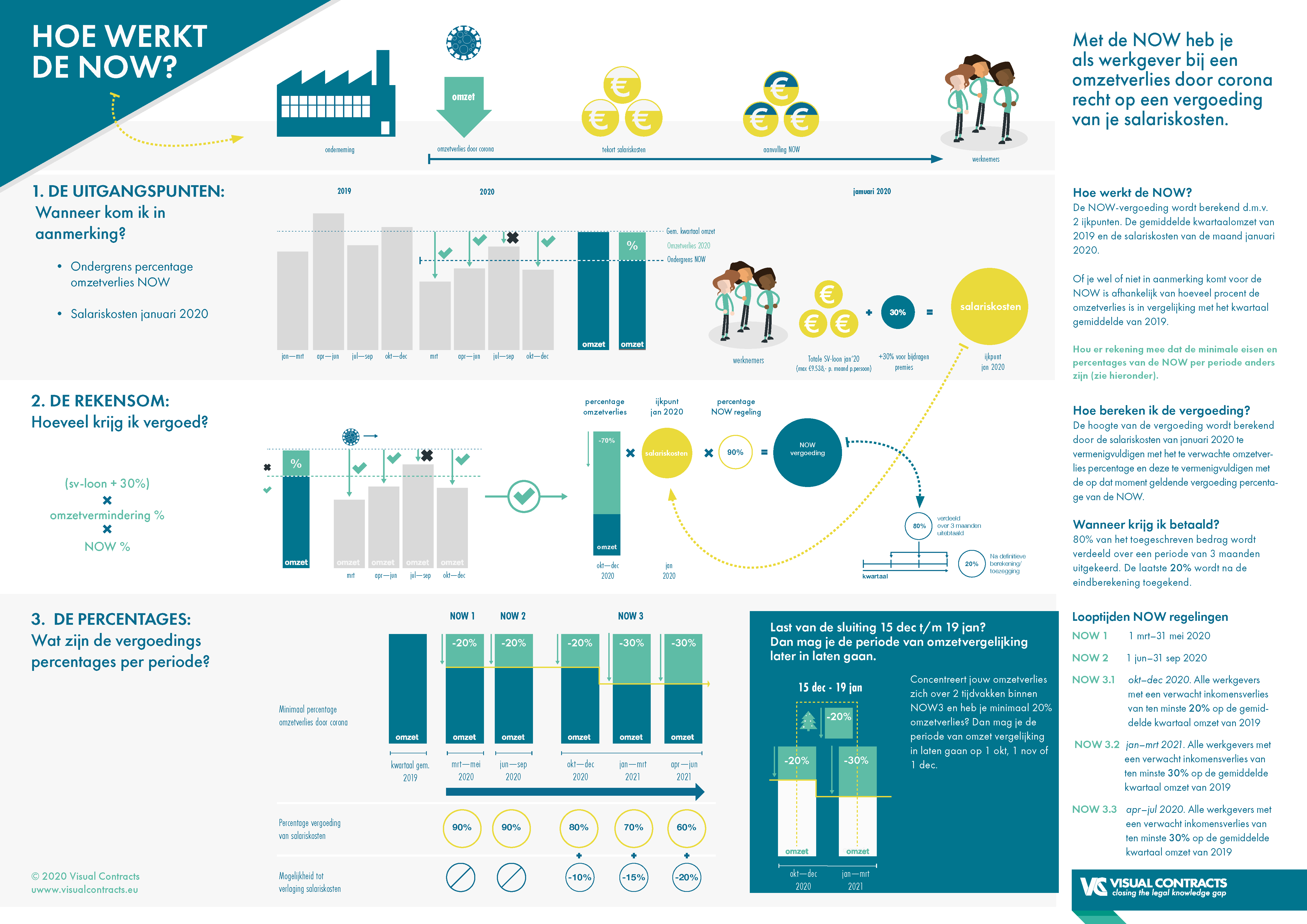
Ten eerste hebben we de update over NOW 3 aangevlogen vanuit het perspectief van de ondernemer. Daarbij gaan we uit van dat een (kleine) werkgever druk bezig is met andere zaken dan de NOW. Zeker als de NOW relevant voor je is, dan ben je als ondernemer waarschijnlijk bezig met hoe je zo snel mogelijk je omzet weer kunt verhogen zodat je geen salarissen hoeft te korten of mensen hoeft te ontslaan en winstgevend kunt blijven of in ieder geval kunt overleven komende tijd. Kortom, je hebt andere dingen aan je hoofd dan continu de NOW regeling exact te onthouden.
Om deze reden hebben wij gekozen om een volledig overzicht van de NOW te geven, waarbij je wellicht updates steeds kunt uitlichten met ‘dit is nieuw/anders’. Maar alle informatie is in één overzicht terug te vinden.
Ten tweede hebben we uiteraard de informatie meer visueel gemaakt. We hebben de informatie opgedeeld in een structuur die kort de hoofdvragen die werkgevers kunnen hebben beantwoord en daar zoveel mogelijk in 1 oogopslag de informatie weergegeven van hoe de NOW werkt. Daarbij hebben we het AIDA principe toegepast. Eerst in 3 seconde krijg je een idee waar de infographic over gaat: omzetverlies door corona, salariskosten en NOW vergoeding. Dan in 30 sec kun je door de visuals, vragen en antwoorden scannen die (volgens ons) aansluiten op wat een ondernemer wil weten. En daarnaast kun je in 3 minuten alle informatie lezen en begrijpen.
Tot slot hebben we de teksten aangepast in meer begrijpelijke taal. In korte zinnen en begrijpelijke woorden maakt dit, in combinatie met de structuur en de visualisaties, de informatie toegankelijker voor iedereen.
Een mooie interactieve visualisatie hiervan zou natuurlijk nog bruikbaarder en toegankelijker zijn (als je bijvoorbeeld direct de NOW vergoeding zou kunnen uitrekenen). Dan heb je een visuele tool. Kortom, voor degenen die hieraan werken bij de overheid, wij houden ons aanbevolen om hierover mee te denken en deze visual en informatie verder te testen en uit te werken.
Dit doen wij graag vanuit een #legaldesignthinking methode, waarbij we daadwerkelijk met de doelgroep onderzoeken wat de behoeften zijn en hoe deze versie de informatie beter overbrengt (of niet) en waar we het kunnen verbeteren. Wij hebben deze versie nu met onze eigen inzichten opgezet in 1,5 dag. Moet je voorstellen wat we zouden kunnen bereiken als we goed zouden kunnen samenwerken hierin!
Ik ben benieuwd wat jullie ervan vinden. Alle feedback is welkom.
Lieke Beelen,
Founder Visual Contracts
-------- English -------
A clear explanation of the NOW: why visual explanation?
Recently I was looking for information about how the NOW 3 was put together. I came across a "visual" of the government. Amazingly, this visual does not contain any visuals. It is only a PDF with frames with text, which is formatted in the government identity style, but again not really visual. They looked at a layout to restructure the text, which is clearly formatted in itself, but there is no clear order / hierarchy to clarify the information. That is exactly what we can emphasize / improve with visualization. However, the information is still not accessible in this version because you still have to navigate through the text yourself to find what is useful to you.

In short, as Visual Contracts and as an entrepreneur with two employees, it seemed useful to me to see what we could improve on this. See our setup in the visual below.

First, we looked at the update on NOW 3 from the perspective of the entrepreneur. We assume that a (small) employer is busy with other matters than NOW. Certainly if the NOW is relevant to you, then as an entrepreneur you are probably working on how you can increase your turnover as quickly as possible so that you do not have to cut salaries or lay off people and remain profitable or at least survive. In short, you have other things on your mind than constantly remembering the NOW scheme exactly.
For this reason, we have chosen to provide a complete overview of the NOW, where you may always be able to highlight updates with "this is new / different". But all information can be found in one overview.
Secondly, we of course made the information more visual. We divided the information into a structure that briefly answers the main questions that employers may want to have answered and it provides as much information as possible about how NOW works at a glance. For this reason we have applied the AIDA principle. In only 3 seconds you will get an idea of what the infographic is about: loss of turnover due to corona, salary costs and NOW compensation. Then in 30 seconds you can scan through the visuals, questions and answers that (from our viewpoint) match what an entrepreneur wants to know. In addition, you can read and understand all information in 3 minutes.
Finally, we have adapted the texts to more understandable language. In short sentences and intelligible words, this, in combination with the structure and the visualizations, makes the information more accessible to everyone.
A nice interactive visualization of this would of course be even more useful and accessible (for example if you could calculate the NOW fee directly). Then you have a visual tool. In short, for those who work on this at the government, we are happy to think along about this and to further test and develop this visual and information.
We prefer to do this from a #legaldesignthinking approach, in which we actually research with the target group what their needs are and how this version conveys the information better or not and where we can improve it. We have now set up this version with our own insights in 1.5 days. Imagine what we could achieve if we could work well together in this!
I am curious what you think of it. Any feedback is welcome.
Lieke Beelen,
Founder Visual Contracts