Invitation design for UvA research project
Project UvA: Designing a convincing invitation for the personalized communication research of UvA.
Team Juridux: Lieke Beelen, Simon Jimenez and Charley van 't Leven
In 2016 the University of Amsterdam was looking for a designer to join their team to design the invitation a.o. for their personalized communication research. Their brief was the big challenge of convincing people of a wide range of ages and backgrounds to join their quite privacy invasive research. Since their goal is to research how websites personalize communication on the internet in order to form new policies, awareness campaigns or new laws, they made a plugin to look over the shoulder of their participants browsing the internet, to collect the data those websites are collecting.
In this article you find the design process of how the Juridux team approached this legal design project. It will discuss the debrief, mapping the user journey, concept development, testing the invitation and finalizing the design.
Debrief
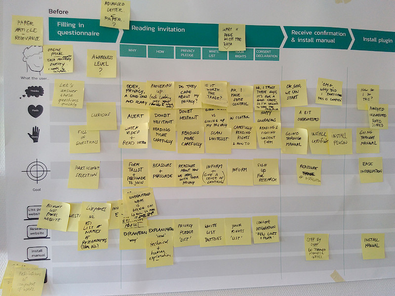
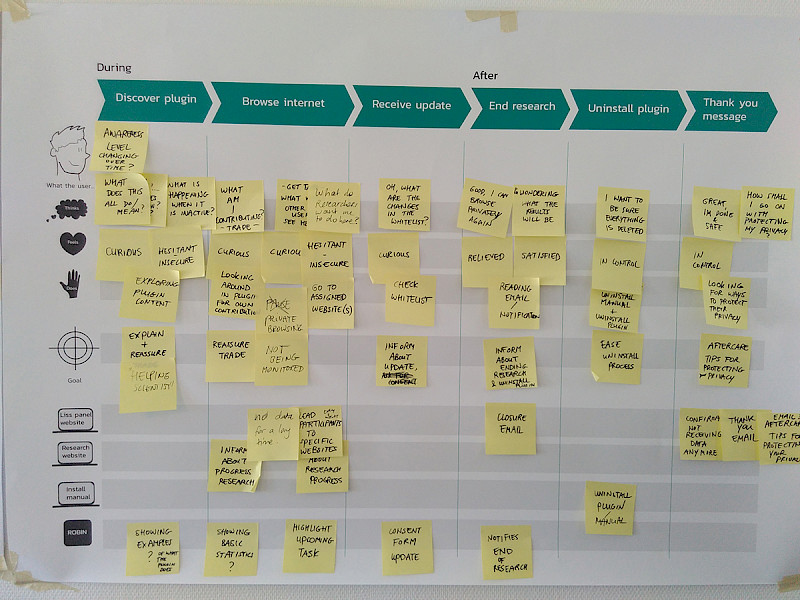
After the first conversations on what this project was about and reading through the briefing material, Lieke made a summary and setup to guide the team through the design process from a service design perspective. She used her insights from the The Hague innovators project (designing an understandable and visual version of the privacy statement of Facebook) and mapped out the user journey that participants would go through if they would participate in the research, as well as a first sketch for the plugin website design. With these posters the UvA team got a bigger picture overview of the experience of their research setup, so they could easily address the pain points in convincing people to participate in their research.
The main takeaways from the qualitative/explorative research Lieke had done during the The Hague innovators price project, were the pattern of behaviour people tend to show when dealing with privacy on the internet. For example people want to know the tradeoff when they share their data. Being in control of your own data is preferable, however people are also willing to give away data more easily if they know what is happening with it. If companies are really transparent, it seems there is a lot possible. Then again, from a design and legal perspective, the question is if you should take that as an entry point for design or if you would want to be conservative in collecting data. During the entire process of designing the user experience of the personalized communication research project, Lieke centered the whole team around this vision.
Underneath you find the posters we used in the first user journey and co-creation sessions.
 |
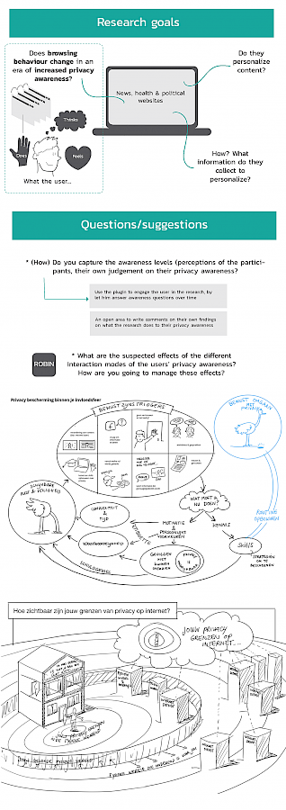 |
The poster with most important needs/pain points were summarized from the insights from both UvA and the privacy statement project Lieke did.
In the scope of this project unfortunately there was not enough budget to really test the user experience of the use of the plugin itself. So the questions/suggestions Lieke made in the debrief on what effect the plugin had on the participants’ awareness of privacy could not be tested via (qualitative) research. This could have given a lot of insights on how people experience the research itself and to know their needs and perceptions, to be able to adapt communication within the invitation design accordingly. Nevertheless, we went on with all the expertise, knowledge and experience of the team itself to further design the invitation and plugin website.
Mapping the user journey
We used the posters of the user journey to go through every step of the research with the whole Uva and Juridux team. The user journey of the personalized communications research was divided into:
-
'Questionnaire (to only invite the right target group)'
-
'Invitation' (Since the participants were part of a panel, they were used to answer several questionnaires a month in order to participate in a research. Designing the invitation in a different (and convincing) way, would make it most likely to get the highest number of participants.)
-
‘Install plugin and receive instruction manual’ When participants were joining the research they would have to install a plugin, for which they would receive an instruction manual.
-
'Installation of the plugin’ was one of the pain points for this research, since it becomes quite technical if you're not used to deal with these kind of applications. This was also the main focus point for the invitation, how to design it to not scare away non-technical people, while still informing about the privacy aspects of it in a transparent way.
-
'Plugin website’ After installation you would land on the plugin website, where you can find background information of the research.
-
'Browsing the internet’ The actual research itself takes place while people are browsing the internet. They will actually not notice that much of the research anymore. The plugin that is installed picks up how (a selection of websites) personalize content on their website. Participants are able to know if the plugin is active when the icon is lighting up when they browse to certain websites. They also have the opportunity to browse incognito (so the researchers would not pick up any data of the websites they were visiting).
-
'Receive update’ The participants get a few questions or an update once in awhile during the research, to follow up on what insights the team got so far and to share what the participants notice themselves on personalized communication.
-
'End research/uninstall plugin/ thank you message’ After the research ends, the plugin can be uninstalled and participants will get a thank you message for participating. (Participants would also get an incentive to join the research).
Concept development
After 2 sessions of running through the user journey of the research, we started brainstorming on how to design the invitation which should convince people to participate as well as to inform them in a transparent way about how the plugin would work.
Together (Juridux & UvA) we brainstormed about what the actual tradeoff and message should be on what people are contributing to when participating in the research. This went from interacting with the researchers, to allowing them to look over the shoulder, to mapping the landscape of personalized communication. One decision that has been made was not to give participants too much control or possibility to contribute, however, main communication had to be focused on the message that researchers would look over your shoulder so they could see what is happening, because resources of the researchers were limited and interacting too much with participants could also influence their behaviour.
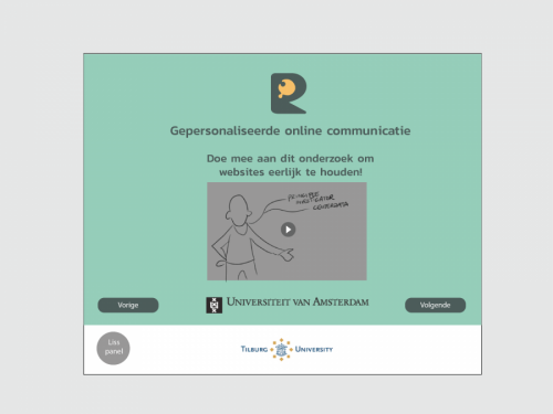
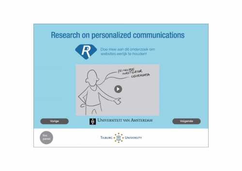
The next steps in the design were then translating the first concept sketch into the environment of the actual research setup, which is hosted by Liss panel of Tilburg University. This influenced the possibilities in the design of the user interface (and thus the user experience) of the invitation, which was limited to a certain screen resolution and step by step approach, since it is mostly used for questionnaires. Nevertheless, we tried to stretch the boundaries of this questionnaire environment as much as possible, to stand out from other questionnaires participants were invited for.
The pictures underneath show the first concepts (in 2 different visual styles) of the invitation design (in Dutch).
Testing the invitation
After going through several iterations of detailing the right message and visualisations, there was an opportunity to send the invitation to a small group (500) of the panel. We were limited to test only a few steps of the invitation design, followed with a short questionnaire. Next to that, we tested the whole invitation really handson by showing it to a few acquaintances. From a design research perspective it would have been great if we would have had the opportunity to test the whole invitation design with a more extensive research setup with 6 - 12 participants (such as observational interviewing), to elicit how people perceive the invitation and getting deeper insights on what the reasons are that people might be hesitant to sign up for the research. (For the people who are skeptical about qualitative research with an amount of 6 - 8 people, please read this article). With the questionnaire however that was send to the 500 people from the panel, we got a first clue of how many people would potentially signup and some of the interpretations of the slides (text and visuals) we made. Based on these insights we improved the main pain points we discovered in the selection of invitation slides.
Finalizing the design
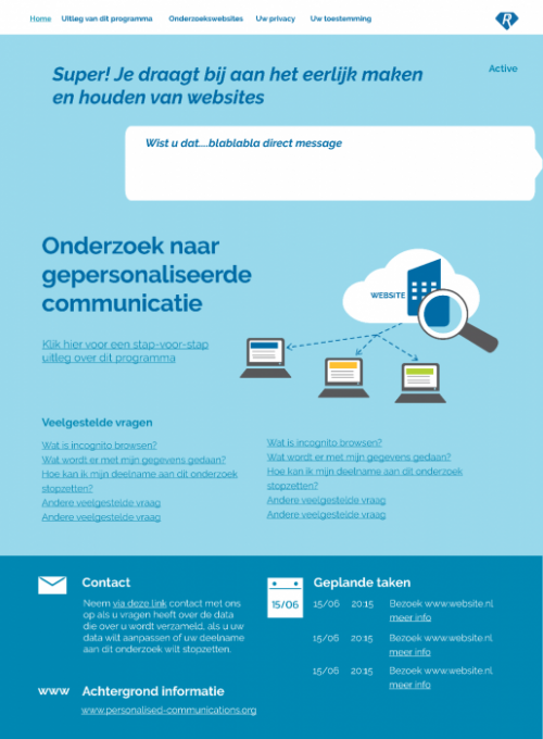
Underneath you find the final design of the plugin website, which includes (a part of) the invitation design, to explain how the research is setup (and what the plugin does). The research is currently running and data is being collected. On the personalized communications website you can follow the research insights.
Plugin website design, including invitation
